
Lux shop case
Оновлено: 28 лист. 2019 р.
* I changed brand name and logo to "lux shop", because company still working on the improvements.
Challange
It was a challange to create modern site for luxury clothing online shop. Put there cool new features from stackeholders and marketing team. We made a lot of reseaches to better understanding target audience and building a perfect UX.

now main page looks like this.
My role in the project
In the project I took a role lead UX designer. I was responsible for UX strategy from sales stage to design stage and managed team. In project involved 3 UX designers. So i divided responsibilities and parts of the work.
The UX strategy was.
Learn more about brand, strategy, luxury trends, what is the target audience,
Scope of our activities was:
Workshops with stakeholders
Workshop with marketing department
Interviews with store sellers
Usability testings and interviews with target audience
Analytics research
Personas
Customer journey map
Sitemap and prototype
UI design review * For each stage we made detailed report and present it to stakeholders.
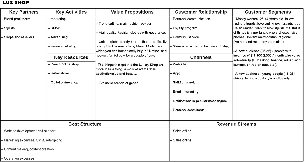
Business Model Canvas
For better understanding business of the client we made Business Model Canvas. After briefing with stakeholders.
Interviews with store sellers

We conducted 7 interviews with sellers in offline stores to find out main insights about a specific segment of the audience
– What are the main patterns of their behavior
– Find out how people make a decision, what is an important things to them in the purchase and what is the main barriers to the purchase, pains and gains
– Empathize with them
Some insights
– Their main need is personal service in different meanings
– Target audience wants to have a suggestions and additional motivation to choose, buy and wear brand
– They like whole style looks, ho to wear examples
– We found two segments: 1 - fashioned (who wants to wear clothe from last collection)
– Information about what is the trends, new collection, brands how to wear tips...
Usability testings and interviews with target audience

Conducted usability testing of core audience and who never buy – Main target was to understand their pains and gains, find patterns in their behavior
We tested even mobile version of the site
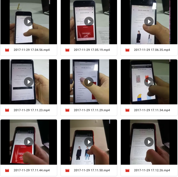
Some insights
–People really needs “add to favorite” functional
– Long time load hurts users
– Complicated navigation
– Weak possibilities to filter items
– Bad quality content, people reject items if they don`t like model. Lack of video content
– Recommendations how to wear and how to combine with other clothing
– Weak motivation to spent more time on site
Analytics research

– We wanted to study the characteristics of the behavior of the audience on the site, to reveal unobvious insights using the analysis of statistics
Some insights
– Main audience come thru mobile devices, most of them women 25-44 (70%);
– returning visitors spent less time on site, rich more pages and buy more
– Undervalued Traffic Sources E-mail, Social, – Even the premium audience wants to get a discount – On direct visiting site bounce rate of the main page, page for women and category to high
– Trying to find items that they couldnt filter
Personas
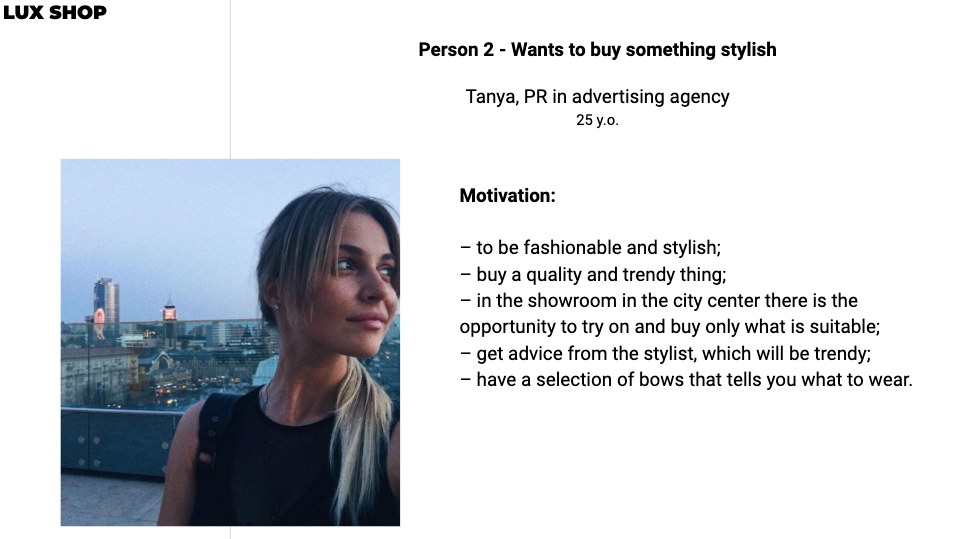
To empathize with users and better understand them, we created personas

Customer journey map
For each person, we created key press releases, analyzed user paths and formed recommendations for improving the customer experience.

Sitemap and prototype
Further we made detail sitemap with all pages and step by step designed prototype of the project in Axure.
Some screens
Including a lot of personalized content, as example magazine-like feed for client according their preferences
Modern product page
What's next?
We presented our prototype to client, made some comments. Then we gave prototype to UI designer. Further send all our work to client. Now client uses our prototype as a "north star" and iterates closer to it making change.
As the example
by default, a section for women was opened as the main page with annoying subscription popup. But client have mens and baby clothes too. But users thought that this site was for women only and almost didn’t go to other sections.
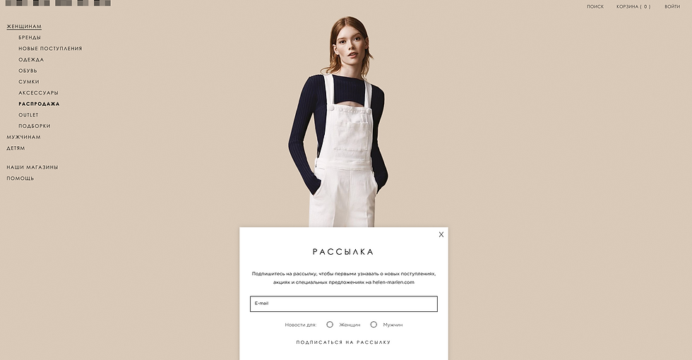
now clearly visible separation
even they add favorits functional. Now users can add to favorites on the site, and not take screenshots as before.


Коментарі